
Bubble.io Group Focus : All you need to know (2026)
Learn all the basics of using group focus elements in Bubble.io.

Thomas Couderq
16 Jan 2025


If you want to create a clean, easy to understand and fluid user experience for your app, you need to know how to use Group Focus.
Theses elements are used in multiple situations and are very convenient to display relevant information to your user or create contextual menus to let them make an action.
Some use case for Group Focus can be this sort of contextual menu below, which allows users to Edit or Delete something.

Or you can also creates tooltips like the one below, which is great way to provide more information to your users within your app.

They can also be used to create a dropdown menus. This type of dropdown menus are often used to create user menu like in the screenshot below.

In this tutorial, you'll learn all the basics you need to know to master the Group Focus element in Bubble.
Let's get started !
Related Read : How to show a Group Focus on hover in Bubble.io ?
Related Tutorial : Group focus in a Repeating in Bubble.io - How to do it ? (2024)
Properties of a Group Focus in Bubble.io
Let's begin by taking a look at the properties of a Group Focus, you'll see they are slightly different from most of the other elements in Bubble.
A group focus has 3 properties that are not present on other elements.
Reference Element
Offset top
Offset left
The reference element is the element to which the Group Focus should be attached. For example it can be the button used to show the Group Focus.
For example, if we take another look at the tooltip I showed earlier, you can see that the element to which my Group Focus is attached is an Icon called "tooltip icon".
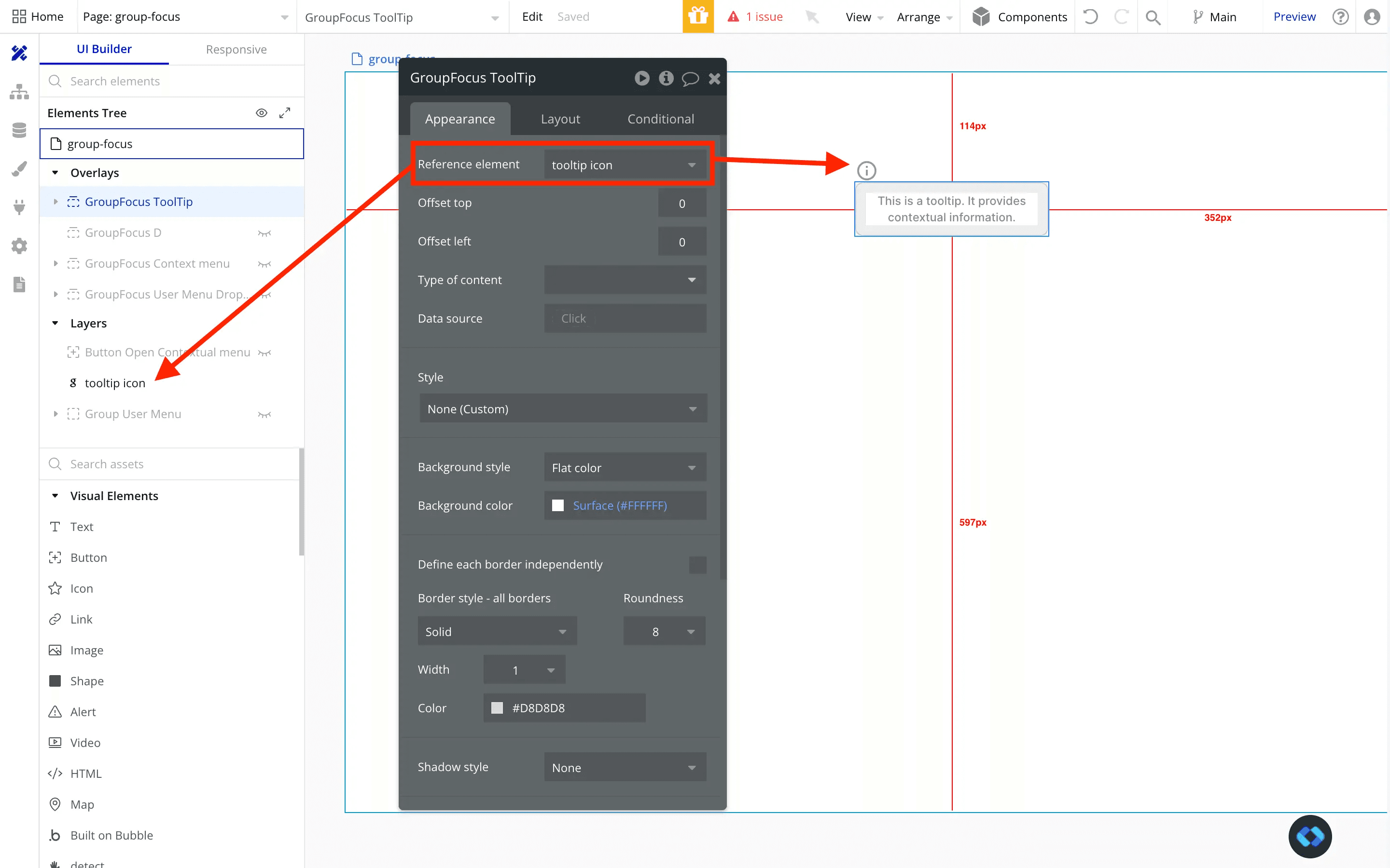
Now that the reference element of my group is set to be this icon, it will follow it wherever it goes and place itself underneath it. Simple as that !
But as you can see my Group Focus is poorly placed because it is aligned to the left. To have a clean design I need it to be centered relative to my Icon and also add some spacing between the icon and the group.
Which is where the Offset Top and Offset Left properties are coming in !
As there name suggest, those properties allows us to set an offset on our group focus (or a spacing if you like).
For the offset top, nothing too complicated, you can add a positive value to push the group downwards, and a negative value to push it upward !
And now for the offset left, you can add a negative value to push the group to the left, and a positive value to push the group to the right.

So here's how it look for me in the end. A nice and clean tooltip !
Showing and hiding a Group Focus
Alright, now that our group is in the right place, relative to our reference element, we need to add some workflows to show it.
By default, Group Focus have a slightly different behavior than the other elements.
In fact, they are always hidden by default, they disappear when you click outside of them and more importantly, they can only by toggled with a workflow.
You cannot use a conditional to make them appear.
For most use case, this behavior won't be an issue. But sometimes you may need it to appear when hovered, and we will soon publish a dedicated article on this matter. But for now, let's focus on the basics.
To show a Group Focus you can use several actions in your workflow.
You can use the Show/Hide actions
Obviously, you can use the basics Show and Hide actions.
But I wouldn't recommend it because you would need to add conditionals to your workflows to make sure to show it when it is not visible, and hide it when it is visible.
Translated into Bubble, it would give us these workflows :
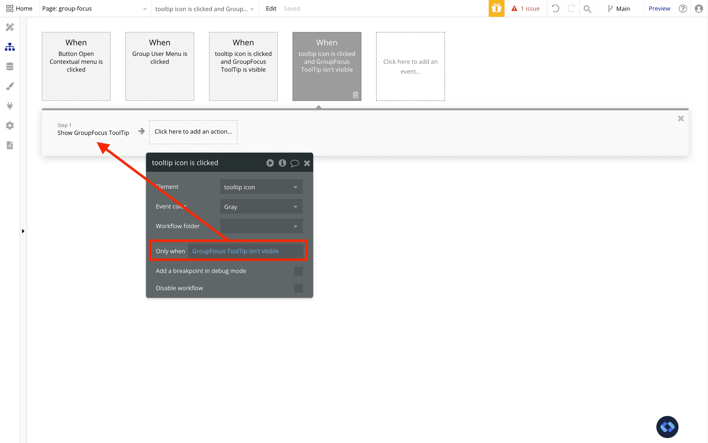
Yes it works, but you need two workflows where only one would be sufficient.
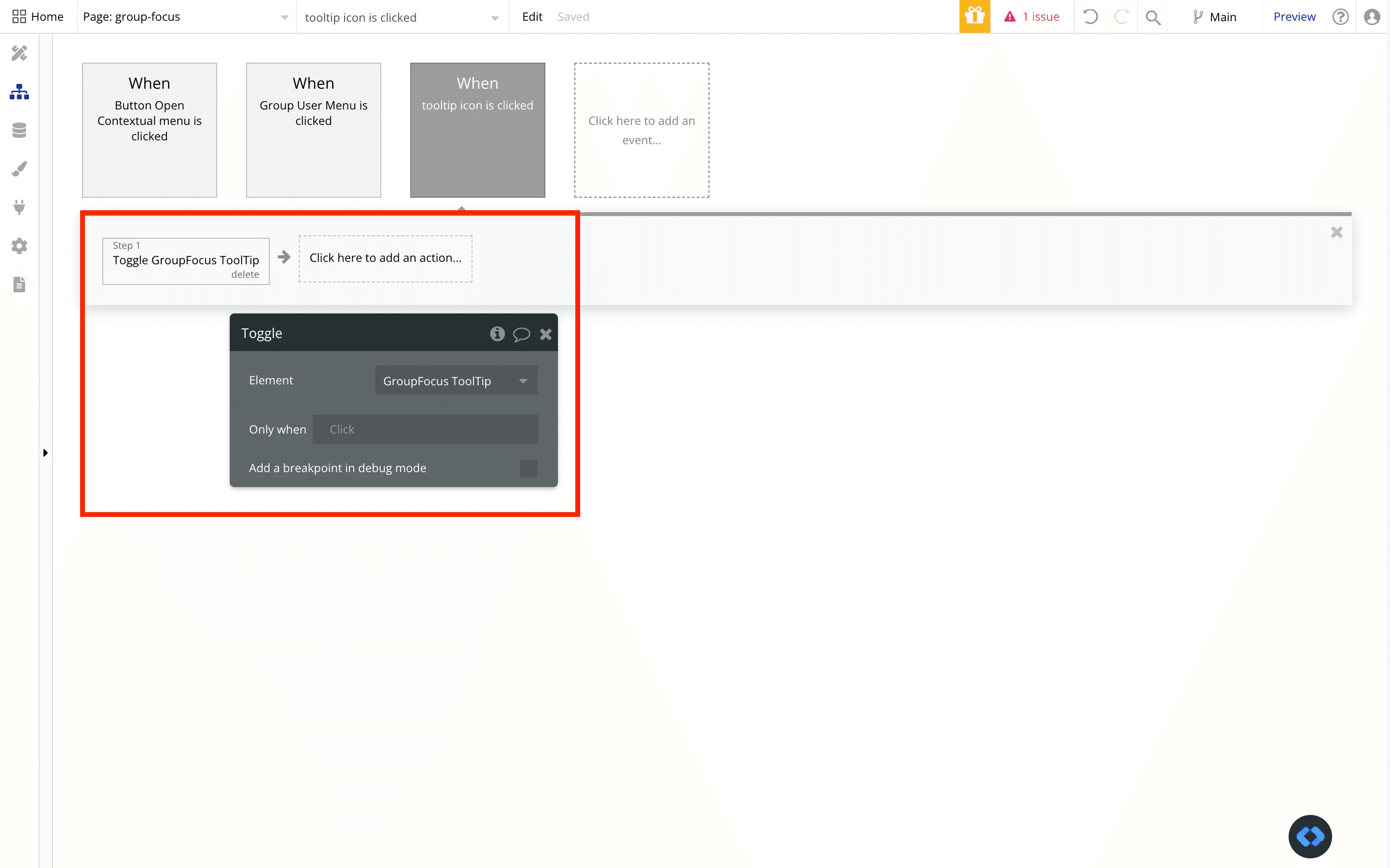
Which leads us to the second approach :
Use the "Toggle an element" action
This is the action I will always recommend you to use for showing a Group Focus element.
Why ?
Because this actions shows the element when it is hidden, and hides it when it is visible. In only one workflow.
You save one workflow, which helps to keep your app lightweight and optimizes your Workload Unit Consumption.
And there you go ! That's pretty much all the basics you need to know for these elements.
Keep in mind that if you want to display dynamic information within these elements, it works the exact same way than with popups ou groups.
Simply set a Content Type and a Data Source, and you'll be able to reference the data stored in the group and use it workflows.
Thomas Couderq
Founder @ Nocodable
I've been building with Bubble for more than four years now. I've launched several projects (with more or less success). I'm passionate about no code and UI Design, which led me to founding Nocodable Components to help founders and professional Bubble developers build faster on Bubble.


Blog
Continue reading!
Check out our other tutorials to continue improving your Bubble skills!