Bubble.io charts - Step by step guide to master them
Learn how to create beautiful charts from scratch, and without any paid plugins.

Thomas Couderq
16 Jan 2025


Bubble.io charts - Step by step guide to master them
Charts are one the most commonly used elements for web applications.
In short, they enable to present data in a clear and comprehensible way to your users.
Which is great. It gives them the possibility to take data-driven decisions, and it's also a good way to remind them how important your product is.
However, working with charts in Bubble can be harder than expected, especially for beginner or intermediate Bubblers.
In this article, I'll guide you through the creation of charts and graphs in Bubble. And by the end of it, you'll know how to link a data source, customize your elements and manipulate your data.
To keep going further in Bubble, you can also read our article on how to create custom skeleton loaders in Bubble.
Step 1 - Installing Bubble's free plugin for Charts
The first step of our guide will be to install Bubble's Chart Element plugin.

This is a pretty handy plugin, that is completely free and developed by Bubble themselves.
As always, you'll find a ton of other plugins doing more or less the same work. Some are good, some aren't, it's your choice to make. Note that some other plugins will have more advanced features to build graphs, but most uses cases won't really need them.
In this article we'll use this one because it's free, and it will suit 90% of Use cases.
Step 2 - Preparing your dataset
Alright, now that our app is ready, we need a dataset of values to display.
In this example, I'm going to use a set a Sales, made by fictitious users :

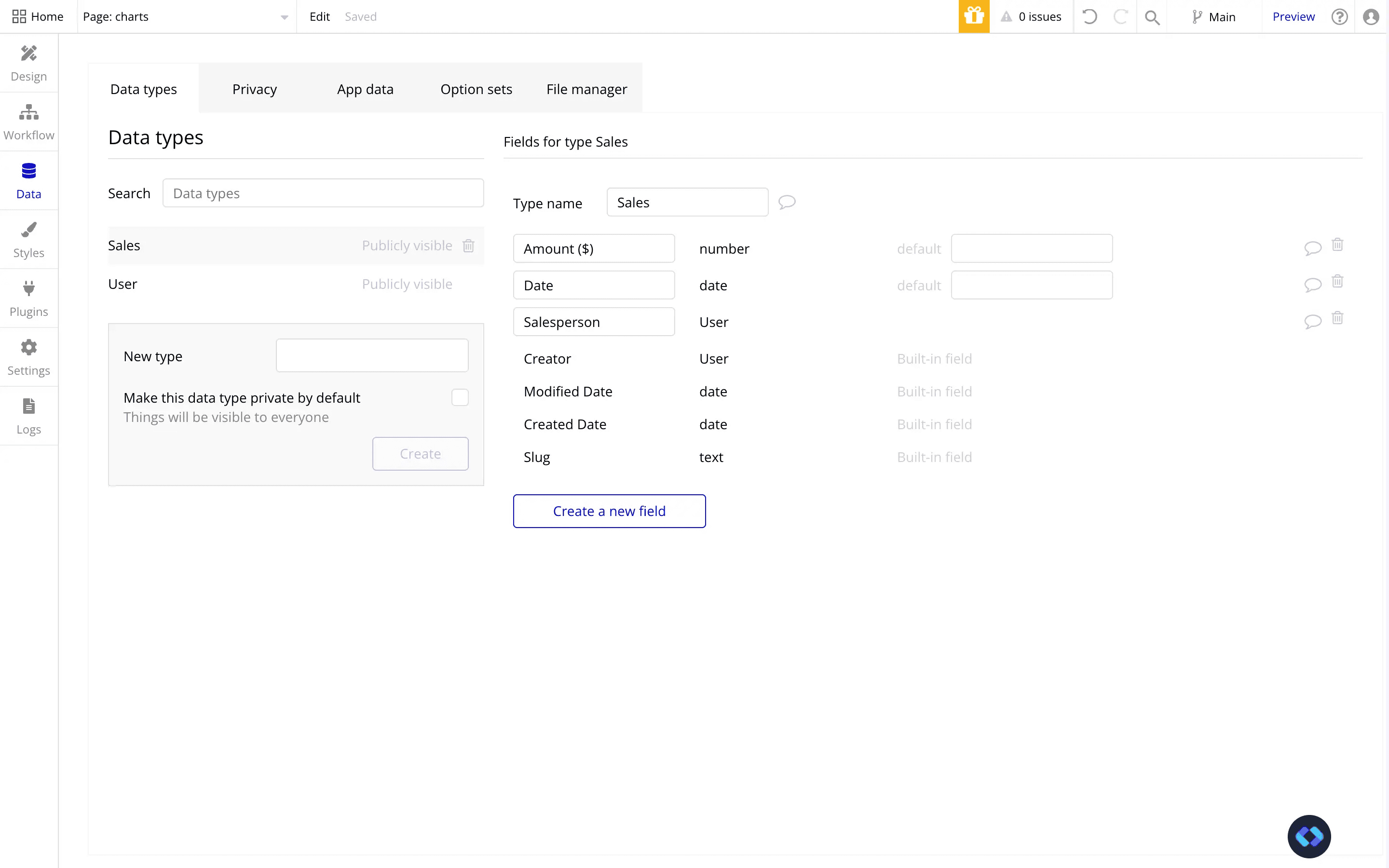

As you can see, my database is structured pretty basically. I've simply linked the Sales record to the User supposed to have made the Sale.
One interesting to note as well, is that for each Sales record, I assigned a date. This will be useful to be able to display the Sales and filter them by dates.
Step 3 - Building our UI
Alright, now let's prepare our interface.
To save quite a bit of time, I've imported a component from Nocodable's Components library.
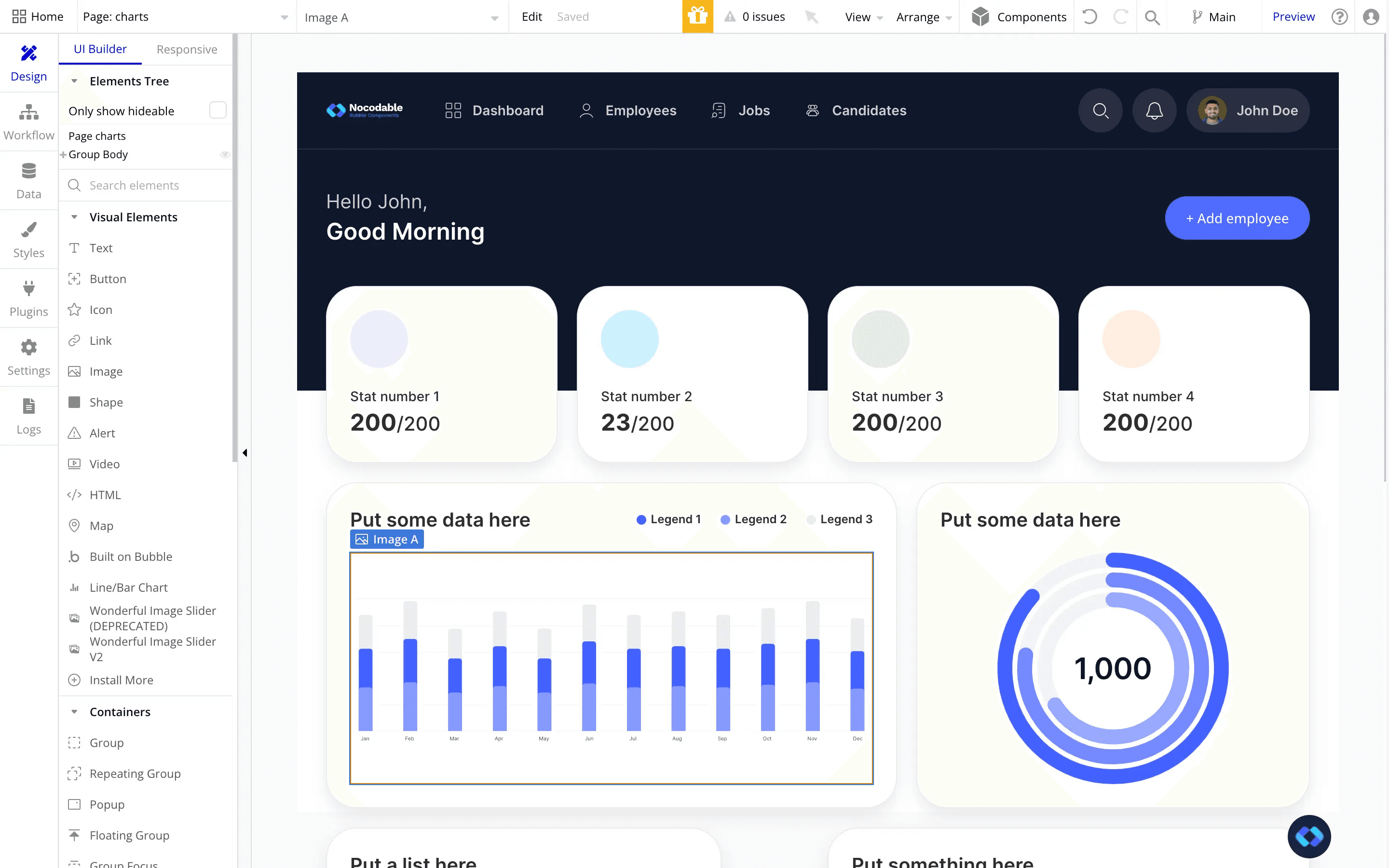
As you can see, it already comes with some fictitious chart, but we'll replace them with our new ones.
Step 4 - Inserting our Chart !
Alright, our app is ready, so let's dive into the more complex things.
Go ahead a drop a "Line/Bar Chart" element into your app
By default, you should have something like this.

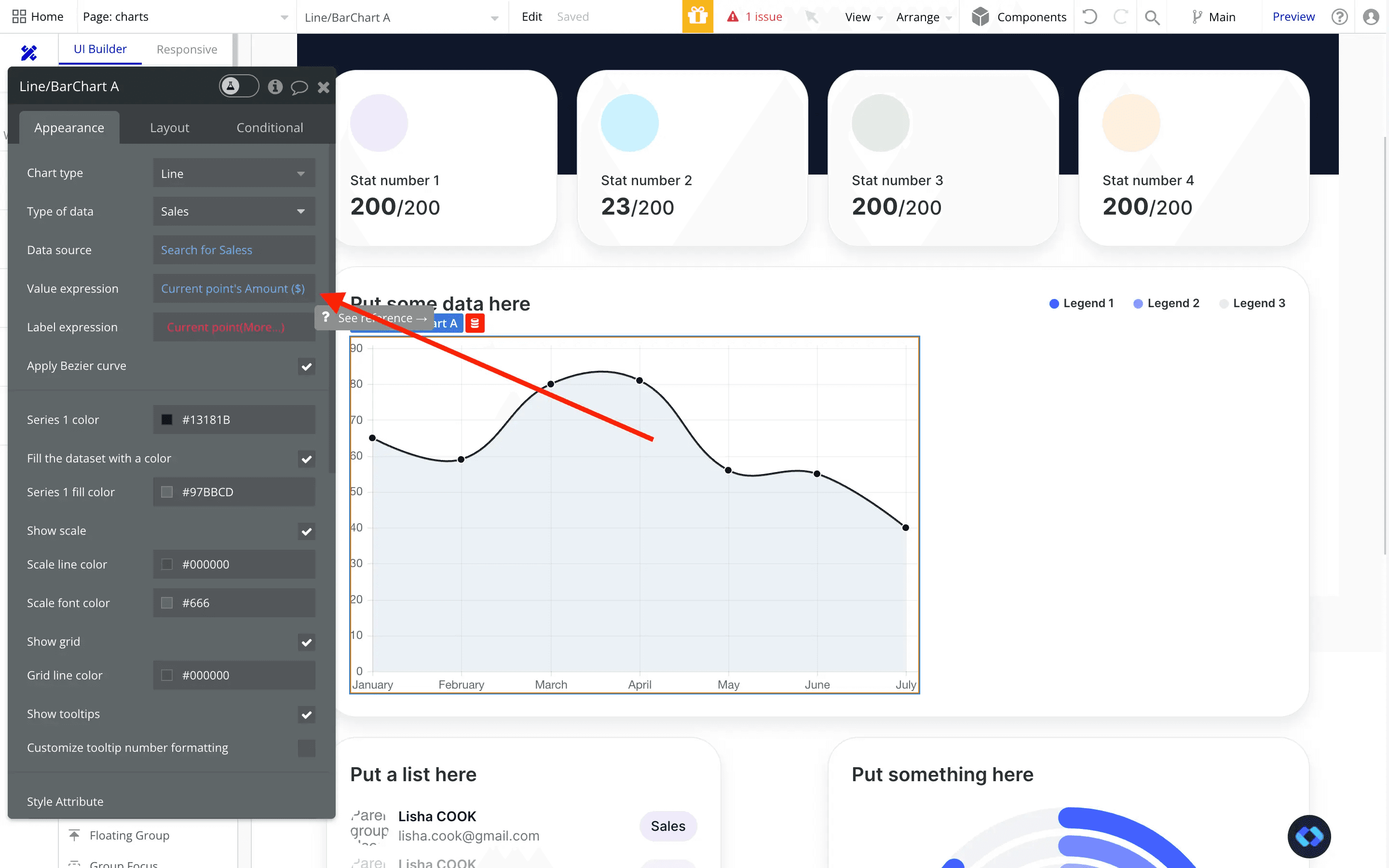
By default, Bubble is not showing all the options it should, so let's fill in the Type of Data and the Data Source :

There we go, we now have two more fields that appeared.
Now, we are facing quite a few options, so let's take a closer look at them :
Chart type : Select the type of chart layout you can to display (Pie Chart, Line, Bar etc...)
Type of data : This is Datatype you are going to insert into this chart. In my example, the type is going to be "Sales". If you want to display a count of signups to your app for example, then the Type of Data will probably be "Users".
Data Source : This is where we are going to insert the actual data. Most of the time, it will be done with a "Do a search for" that will return a list of datapoints. In my example, I am going to do a "Do a Search for Sales"
Value Expression : This is the actual value of your Datapoint. Most of the time, this value will be a Number. In my example, this is going to be the "Amount" attribute of Sales record.
Label Expression : This is the value displayed on the horizontal axis of your chart. It can be a lot of things, but most of the time it will be a date, or a month.
Apply Bezier Curve : Check this if you want to smoothen the curve of the line (i.e if you don't want angular peaks)
I won't cover the rest of the fields, as they are more self explanatory, and here for design purposes only.
Step 5 - Manipulating our data source
Good, now our graph is ready to be set up.
We've inserted our Datatype and Datasource (if you did not, go ahead and do it !), we now need to work on the Value and Label Expressions.
As said earlier, the Value expression if the actual value of your Data Point. It represents the vertical axis of your chart.
In my case, this will be the Amount attribute of my Sales record, so I'm going to fill it in :
Alright, and now let's work on the Expression.
This will really depend on your use case, you may want to display your data series in a particular way. But remember that this represent the horizontal axis, and most of the time it's a date.
In my case, this is indeed going to be a date. So I'll go ahead and fill it :

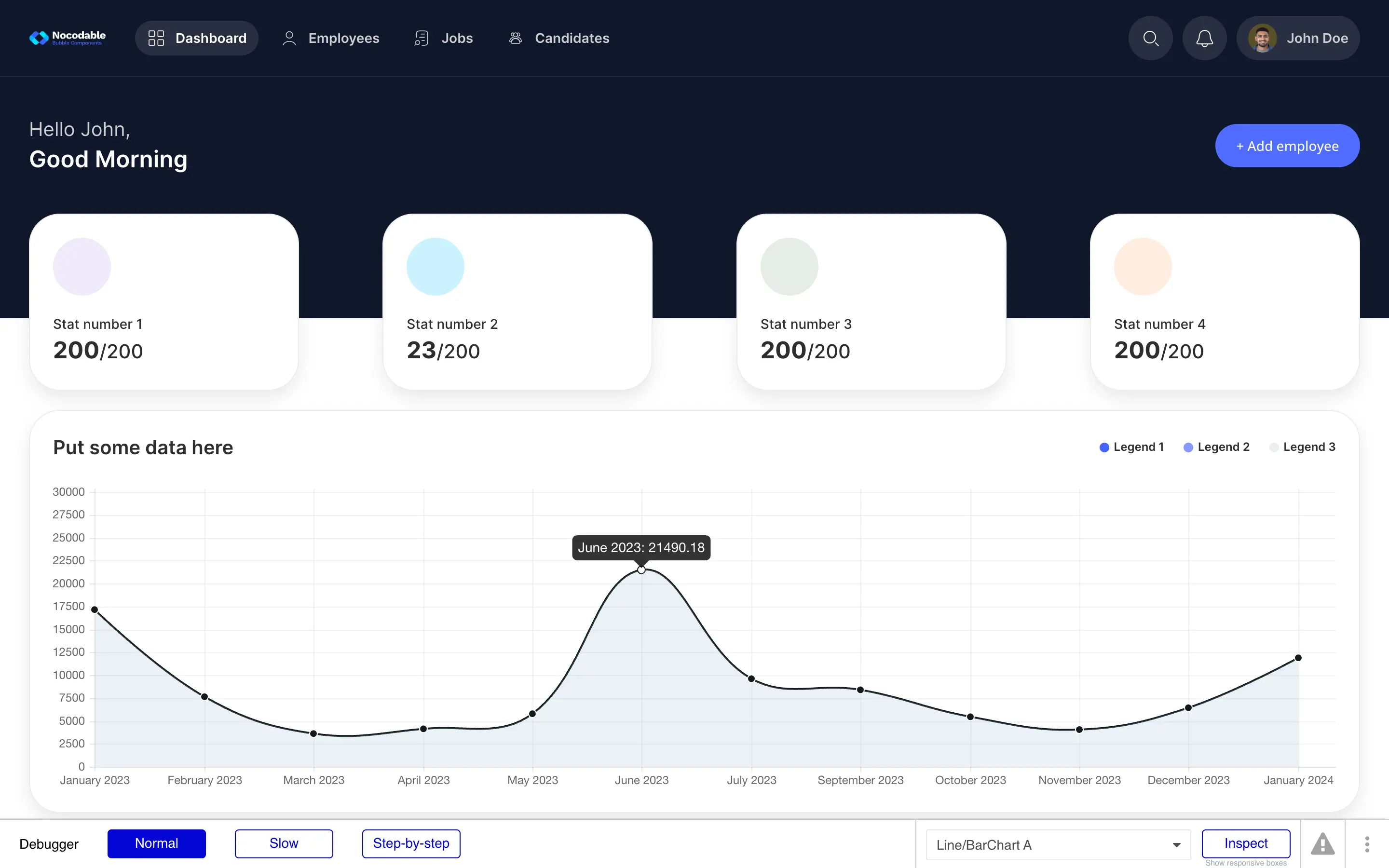
Okay, so we should now have an already working graph (but not polished yet).
Let's hit preview and see what it looks like :

Alright, it's starting to look like a real graph.
However, we can see some issues :
The dates are not formatted correctly, making the graph too crowded and hard to read.
The data points are not aggregated. Meaning they simply show one after the other. The logical approach would be to group them by month.
So let's work on these issues !
Formatting our dates correctly
If you remember correctly, the data presented under the horizontal axis of our chart are set in the "Value expression" input.
In my example, I inserted the "Current Point's Date", which is fine, but lack formatting.
To resolve this, we'll simply add a :formattedAs operator.
This will enable us to choose the right formatting for our dates.

And if we do a new preview, here's what we have :

Alright, now the dates are formatted correctly.
Grouping (or aggregating) our data points
Now that our dates looks good, we need to add a grouping to our data series.
To do this, lets go back to the "Data source" of our graph and add a Grouping to our search.
This can be done with the :groupedBy operator.

In Bubble, when your group a Data set, you're present with two new options : Grouping and Aggregation.
The "Grouping", will take care of putting all the corresponding elements in a same group, depending on your criteria.
In my case, I want to create to group my Sales record by month, therefore the grouping will be based on their Data attribute.

So now for example, instead of having multiple element in my graph for June 2023, I will have only one element (which will be the group of elements I created).
Now, we need to take care of the aggregation.
The aggregation is responsible of making an operation on this grouping (it can be a Sum, a Multiplication etc...).
So let's go ahead and add a Sum to my grouping.

And there we go, now my grouping will present the Sum of the amount of my sales, for each month.
Now we simply need to update the Value and Label Expression to reflect our changes :

There we go, and now we can hit preview :

And there we are !
A nice looking, clear and efficient graph.
With it, we can see that June 2023 was a very good month in terms of Sales !
Step 5 - (optional) Filtering your data base on a time period
Now, one last thing that would probably be useful for your users is to be able to filter these data based on a time period.
For example, we may want to this graph for Sales made between 1st May and 31st of July.
To do this, we'll need to add a few things to our page, as well as modifying our Data search.
1 - Add two Date Pickers to your page
Now obviously, we need to allow our users to pick a Date Range on which to filter our graph.
To do this, simply add two Date Pickers. One for the Start Date, and the other for the End Date.

2 - Modify the search for data
Now comes the last step : actually filtering the data based on the date.
To do this, we'll need to modify the Search in our Data Source to add two constraints, as follows :

IMPORTANT : Make sure to check the "Ignore empty constraints" checkbox
Conclusion
And there you go !
You now know the basic on how to create professional charts for your Bubble application.
I hope you like this article !
Happy building,
Thomas
Thomas Couderq
Founder @ Nocodable
I've been building with Bubble for more than four years now. I've launched several projects (with more or less success). I'm passionate about no code and UI Design, which led me to founding Nocodable Components to help founders and professional Bubble developers build faster on Bubble.


Blog
Continue reading!
Check out our other tutorials to continue improving your Bubble skills!